Sentinel-5P
NO₂, O₃, SO₂, CO, and CH₄ with daily global coverage since April 2018 and near real-time products: the series that shows year-over-year trends above your city.
daily global · since 04-2018
Is your low-emission zone working? Since July 2026, Europe measures its pollutants every hour from space. We build the panel that joins satellite and ground stations so you can answer with data.
Sentinel-5P daily since 2018 · Sentinel-4 hourly over Europe (07-2026)
Two satellites and a station network, all public and with clear commercial licenses.
NO₂, O₃, SO₂, CO, and CH₄ with daily global coverage since April 2018 and near real-time products: the series that shows year-over-year trends above your city.
daily global · since 04-2018
In service since July 2026: hourly pollutants over Europe. From a daily photo to the hourly pulse of air quality.
hourly over Europe · 07-2026
The European Air Quality e-Reporting: per-station series since 2013 in near real time, with a REST API and a CC BY 4.0 license. The ground truth that anchors the satellite.
REST API · CC BY 4.0
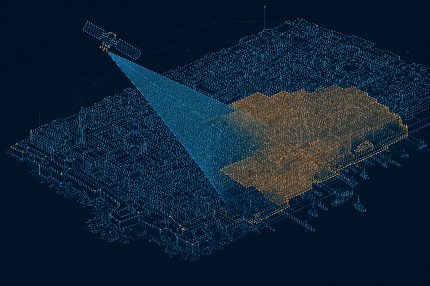
First, the real scale of the data: the satellite works at kilometer scale. It is right for trends, alerts, and evaluating a low-emission zone as a whole; the detail of one small source belongs to the ground stations. With that clear, the panel: NO₂ and ozone trends over your city before and after each measure; episode alerts; fusion with your stations and the European network; and reports ready for the council or the air quality plan, served through an API or MCP.
Sentinel-5P measures NO₂ every day, a gas closely tied to traffic and combustion, along with aerosols, the tiny particles that cloud the air. At kilometer scale it gives you the context: which days and which broad areas of your city breathe worse. Your stations add the street-level detail, and together they form a full picture.
Sentinel-5P · NO₂ and aerosols · daily
We combine the satellite data with your stations and with population to draw an exposure map over your low-emission zone: which areas hold the most pollution and how many people live in them. It is the basis to adjust limits, access, or priorities with a clear rationale. You move from a citywide average to seeing who is most exposed.
satellite and stations · exposure map
When you start a restriction, the panel compares the pollution series before and after, taking weather into account so you do not confuse the wind with the effect of the measure. You see whether it really moved the needle, and by how much. You bring the council or the air quality plan a check backed by data, not an impression.
before-and-after series · measure check
Tell us your city. We will show you its NO₂ series for recent years, and the panel we would build on it.
Talk to the team